Mobile Friendly

The term ‘responsive design’ has been worn out, but Bakob lives up to the promise, with device preview screens, percentage based element widths and device visibility control.

Pixel Perfect

Total Customization

Section width & height

Go beyond the over simplified and generic page designs, by having more control over the various sections. Elementor’s page sections make up the basic architecture of the page, and allow you to reach a level of design reserved until now for high budget custom designed websites.

Resize columns

Tinkering with the size of the columns has never been easier. Grab one of the corners and drag it until the column layout is just right. You can also choose from default settings and easily add more columns to the row. With Elementor, You have complete control over the height and width of your columns.

Column & content position

With Elementor, you can decide to position the column to the top, center and bottom of a section, or stretch it out to the whole section. You can also position the content within the column in the same manner. This unique feature gives you the freedom to create a design that is much more customized.

Padding & margin setting

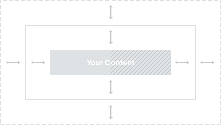
Set the padding & margin for sections, columns & widgets, using px, EM or %. This feature is unique to Elementor. Without using % or EM, the heading you set may end up looking huge in mobile. Our dynamic size settings lets you take full advantage of the various scaling possibilities.

Column gap

Change the gaps between columns in order to let your design breathe. By changing the gaps at once, you can try out different column layouts, and visually decide which one has the best fit. This setting is amazingly simple to alter, but makes a huge difference on the ending result.
0:00
0:00